Thursday, 12 March 2009
Who would be the audience for your music product?
 We think a 15 classification is most appropriate for our film, and there are several reasons for this choice.
We wanted our film to gain maximum viewers and in order to do this we needed to make it appeal to a wide audience. This means adults would want to go see it as well as young adults. If our film was to be a 12a i think that it would attract young audiences but adults may think that its too childish or not consider it as a true crime caper. Crime capers are traditionally quite violent and strong language is commonly used. For example Snatch which is an 18 consists of strong violence and strong language. But we didn't want our film to be so limited in audience that young adults would not be able to go see it, so we thought a 15 was best. A 15 classification allowed us to have a proper crime caper which is quite violent and keeps traditional features but gains a wider audience.
In our feedback notes form members of our class noted that the slow start was quite tense as they didn't know what was going to happen and that the gun shot was realistic and scary - This is going to be consistent throughout our film. This shows that a 15 classification is appropriate.
Labels: Anton
The construction of our production company logo
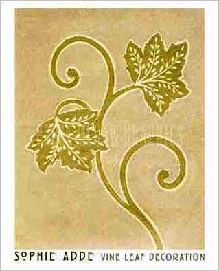
We started with the name Vinewere and then tried to incorporate the image above of a vine.

I then polarized the image to make the vine a silhouette and attached them to the ends of the letters to create the logo.
We then took this image of a hand painted vine and added a neon glow filter to it.

we finally combined the two and this was the final image.

Labels: Adam
Wednesday, 4 March 2009
Teacher Comments
Further to our conversation in class, action points to take forward from rough cut to final cut include:
- Re-edit so that titles and live action are intercut with one another.
- Edit the ambient sound in the opening shots (possibly remove it and add garage band music track?)
- Re-edit so that your total running time is approximately two minutes.
- Currently the events in the sequence do not make a whole lot of sense. Can I take it that they have not yet been edited into sequential order? Remember to edit for an unfamiliar audience. This has to look like an opening sequence.
Labels: Hannah
Friday, 27 February 2009
Wednesday, 25 February 2009
currently working on.
Currently we are working on the rough cut of our opening, the live action of our opening will be cut down to the certain parts we plan to use. Our live action footage that has been shot is just to establish our story and get the action started.
We need to decide the style of the freeze frames, we have ideas and samples it just a case of coming up with the finished product.
Labels: Chloe
Thursday, 12 February 2009
Freeze Frame Samples
We decided to create samples of what our freeze frame images could look like and what style it may be in.
Sample One.
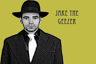
* Simple background
* Poster Edge Filter - Making the person stand out
* Appropriate Text Style
Sample Two.
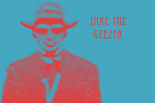
* Simple Background
* Filter - Highlights certain areas
* Same Text style
Sample Three.
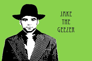
* Simple Background
* Threshold Style
* Same text style, different layout.
Sample Four.
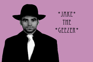 * Simple Background
* Black & White Effect
* Stars Added To Text
Sample Five
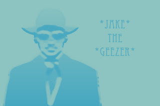
Simple light background
Same text style stars added for effect and to show importance
A filter added, stamp like filter.
Sample Six
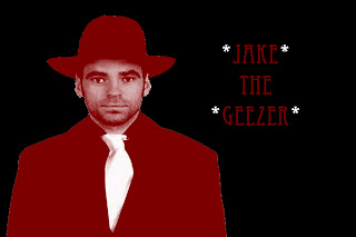
Plain black background
Red overlay added to make the character stand out
Same text style
Sample Seven
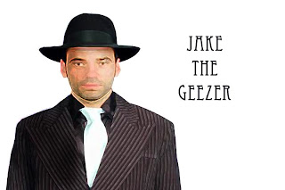
Simple background
Blurred image and burn toll use down one side
Same text style
Sample Eight & Nine
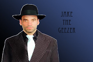
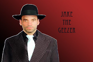
Same text style
Gradient tool used on backgrounds
Same blurred image and burn tool used down one side.
Labels: Chloe.
Wednesday, 11 February 2009
Progress So Far.
Within our group so far we have look at different opening of different crime films, such as "Sin City" & "Snatch". We have made to analysis of both sequences, just explaining what we like and dislike, how the different effects look and how we could use them or something similar in our own sequence.
We have added the openings to the blog also, just so that there is that visual there, making it easier for other people to understand our analysis.
Our synopsis it very detailed and gives the story in a nutshell, telling people about the dialog, characters and the effects from other films and how we could use them.
The Mood Board we have created just shows how hackers come across, such as computers, codes and how hackers are seen as Geeks. Guns and buildings and film pictures just to show the crime side of our opening.
Labels: Chloe
Mood Board
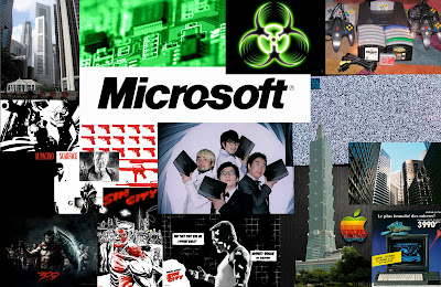
Many Different Factors and ideas helped us choose the images of this mood board.
- The landmarks/Skyscrapers represent wealth and power the hackers target.
- The circuit boards/computer equipment represent the technology used by the hackers.
- The Geeks pictured in the centre represent the personalities of the protagonists (The Hackers).
- The large Microsoft and Apple logos represent technology involved and also are the market leaders in operating systems and are recognisable to the audience. Furthermore it conveys the conflict and competition of the computing profession.
- Guns convey action, crime and violence which and strong factors of the story line.
- Red, Black and white colours represent the overall visual tone of the presentation.
- Sin City, 300 and Scarface images illustrated the comic book style/polarized images we are using to introduce the characters (as seen in snatch).
Thursday, 22 January 2009
Synopsis of opening sequence
For our group’s project we plan to make a Crime caper style Opening sequence for a feature film. The story for our crime caper is about Computer Hackers who plan to steal millions out of a crooked Bank Chairman. The story features an ensemble cast that use their skills as hackers to accomplish their mission. Comedic value is achieved in places by certain characters personalities and actions e.g. their “geeky” persona’s and their lack of ability to carry out the more physical aspects of their mission.
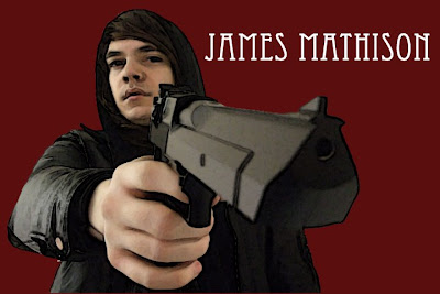
The opening sequence starts with the display of the Vinewere production logo and signature Jingle. After this proceeds a live action sequence. This sequence opens with a man walking along a path in the dark. There is a voice over of the protagonist voice to show the sequence is a flash back. The man reaches a building and enters. Scene cuts to another man sitting in a darkened room in front of a computer typing. The other man enters the room. The man in front of the computer not looking up from his computer screen say’s “Get out, I said I don’t want to be disturbed”, the other man say’s, “Joseph Max?”. The computer man answers “What is it to you?”, the man at the door say’s, “I’m looking for Joseph Max”, the computer man answers “Well you found him”, the man at the door say’s “Thank you”. He pulls a pistol from his coat and shoots the man at the computer. As the assassin shoots there is a polarised freeze frame on him where his name flashes up. The title sequence then proceeds with stylized freeze frames of each of the ensemble cast.
The colours and over tones we wish to achieve within then film are much inspired by comic book style films like Sin City, The Warriors, 300, ect. We also plan to stylize our titles to make them more interesting.
Labels: Adam
Sin City Opening Sequence Analysis
Sin City opening sequence begins with a two character on a balcony of a building. The two characters are male and female and everything is seen in black and white apart from the woman's dress, lipstick and eyes. As they are chatting a narrator is talking throughout the sequence. Light 20s style music is played as the man approaches the woman. The man and woman chat until near the end when the an kills the woman. The camera zooms out into a birds eyes view of Sin City which forms the words "Sin City" Blood forms into the solid red text. Afterwords heaver music with 20s style theme is played throughout a comic book style title showing the actors names. The actors names are all shown in red with a white outline. The font the titles are in comic font with a torn and broken look to them. The actual film title "Sin City" is solid red text which represents the violence that goes on in this city. Towards the end the remaining titles are shown with a black background.
Labels: Anton and Adam, Chloe
Snatch Opening Sequence Analaysis
The Snatch opening starts with a group of 4 people dressed as Jewish priests seen on several security monitors. We follow the group of people who making there way through a building. They are eventually let into a room where they reveal who they are and threaten the people to give them a diamond. The credits are shown throughout and are in basic text with a black background. The music is played for comic effect to go with the costumes of the 4 people. The music changes when they reveal there weapons and threaten the people. Afterward we are introduced to all the characters individually shown then different objects are used to link the them to the next character. During this sequence each characters names are introduced with a freeze frame of them. There is a heavy bass line with a guitar which gradually becomes faster and more up beat then slows down again towards the end of the sequence.
Labels: Anton and Adam, Chloe
Monday, 12 January 2009
Warriors Opening Analysis
The warriors begins with a comic book style opening introducing the story and each of the characters separately. though the live action section of the sequence music is used to build the tension of the following scene.
Labels: Adam and Anton


